About me
Everything started with a passion for web technology, in particular HTML, CSS and Flash.
When I first started I did not know much about content management systems and would rely solely on my skills in HTML & CSS. I would hard code every aspect of the website and this gave confidence and flexibility in meeting my client’s needs. Having also a diploma in Art helped refine my touch as a designer adding to my skills the ability to develop web designs from scratch accompanied to creative design.
I consider myself versatile, reliable and professional. I always try to exceed client’s expectations ensuring excellent results in both development and design.
I believe that a developer must also be a designer in order to have a holistic view of the work from the technological point of view but also from the visual one.
-

Merkle
Lead Email Developer
Develop complex and customized HTML email code that adheres to industry best practices and brand guidelines, and closely matches the original creative design. Additional esponsibilities are consulting on technical capabilities and considerations, performing quality checks and peer reviews, managing changes and updates, scripting for dynamic content, personalization, and segmentation, managing HTML content and related assets within clients’ email platforms and work with email account production managers to coordinate campaign assets.
-

TWO Associates
Email Developer Lead
Responsibile for coding responsive bespoke emails and customisable email tempaltes for finance clients such as BlackRock & iShares, BGF, Lyxor, Tirol, campatible for Oracle Eloqua, Marketo, MAPP, OutCast ClickDimension and many more. I am also responsible for working on exisiting emails and Dev QA using Email On Acid and working closely with the creative team when facing issue during the process. For most of our clients I created HTML spippets in order to speed up the productivity of the team, I created Master tempaltes compatible with related platform (Oracle Eloqua, Marketo, MAPP...), creation of webdoc and How-To-Use email template documentation for our clients.
-

RAPP UK
Email Developer
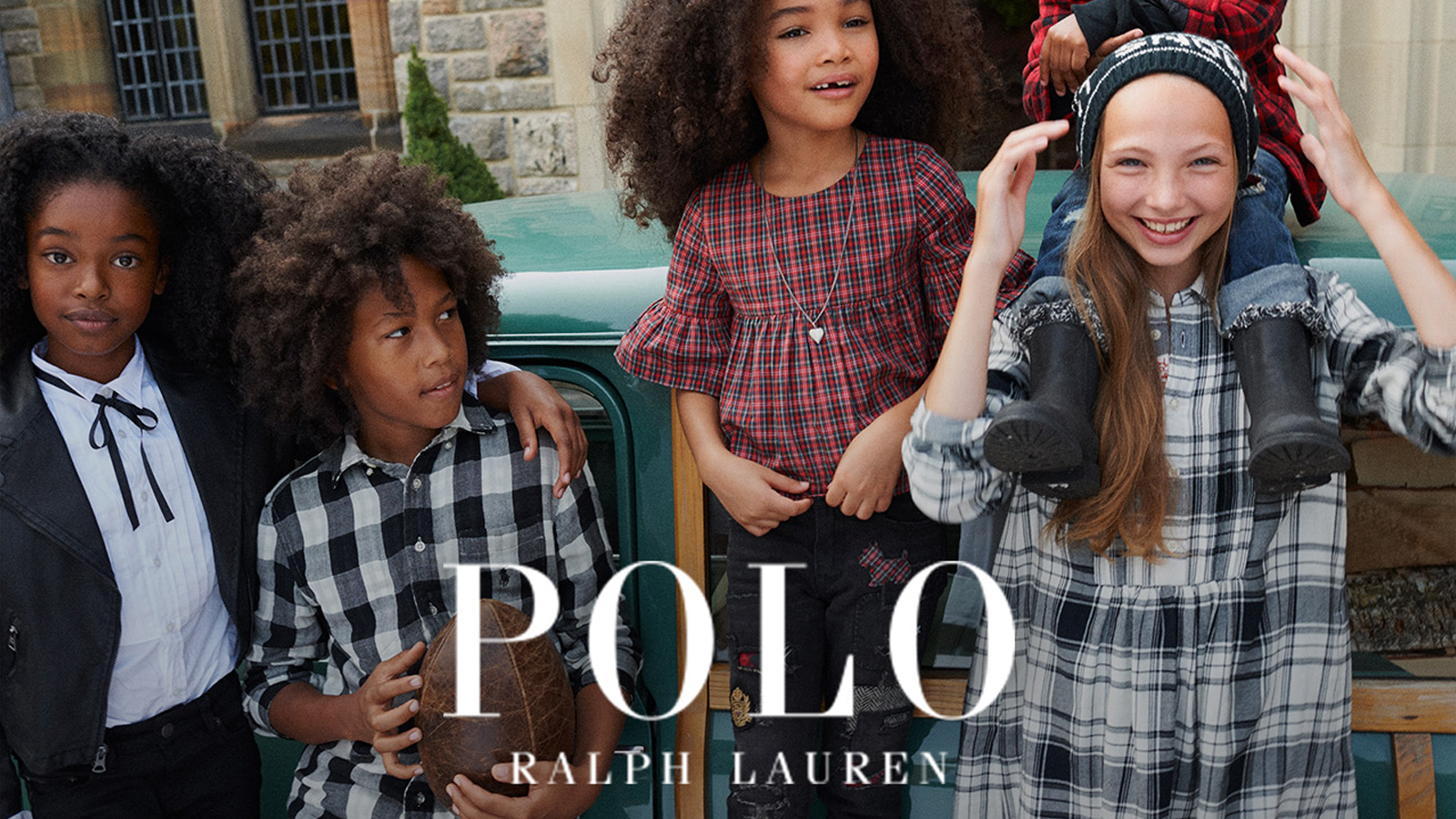
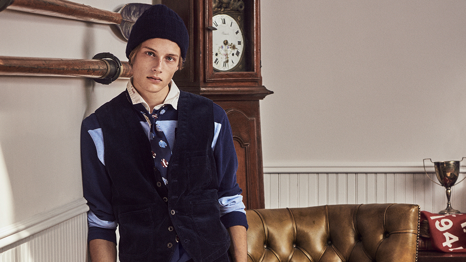
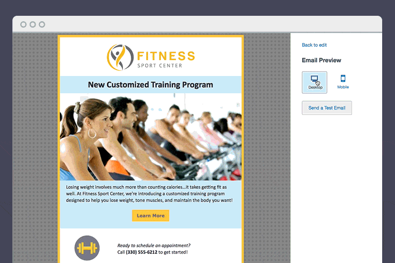
I was responsible for creating HTML email modules in Salesforce Marketing Cloud for Ralph Lauren, working closely with a SFMC Technical we created 66 modules with Drag&Drop functionality split in 2 business units, testing the emails across ESP with Litmus, troubleshooting and QA testing.
The modules included AMPscript in order to take the country, language, modules, exclusions, segmentations, copy, images and links dynamically from a CSV file having only one template. Together with SFMC Technical and Service Delivery Director have created an Excel project tabs called "Matrix", this project tabs is formed of 4 tabs that contains all the information about the campaign, from country to segmentations and more.
The goal of Matrix was to create 30 emails in no time and facilitate the client with email marketing campaigns.
I have contributed into coding Montblanc's HTML responsive email modules and creation of GIFs. I coded new interactive modules in order to increase open rates. The modules are actively used by Montblanc.
Occasionally I created evites for Burberry in a platform called Adzu property of Code worldwide (my department in RAPP).
I played a role as consultant for other RAPP's clients, I was suggesting what approach to use for particular client's request or if a particular effect or functionality was possible to be used in HTML emails and in case provide the code.
-

OTM Create
Email Developer
Responsibile for coding responsive and non responsive Global Email Marketing for HSBC Bank and Citigold Bank. Testing email across Email Service Providers using Litmus and fixing existing emails. I worked closely with designers and Account Managers
-

Display Block
Email Developer and Designer
I have hand coded larger scale projects for clients such as SpaceNk, Timberland, Dogs Trust, Richer Sounds, Gorgeous Apartments, Starlight Childerns, Purple Parking, Meteor, Medihow and Display Block.
I was responsible of development and testing of hand coded HTML emails across all the major Email Service Providers (Hotmail, Yahoo-mail, Gmail) using Email On Acid. Creating HTML5 snippets. Fixing problems encountered in the functioning of the emails and functionality and appearance of an email, testing emails in different email providers & at diffrerent resolutions. -

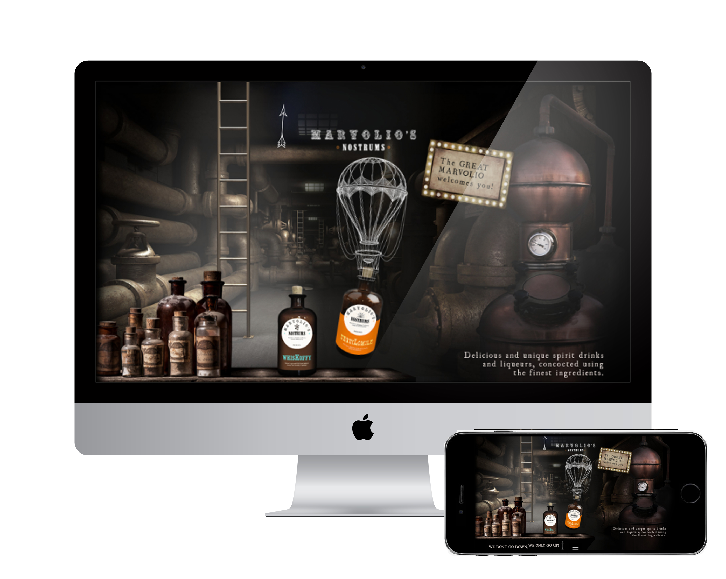
IM London
Digital Designer
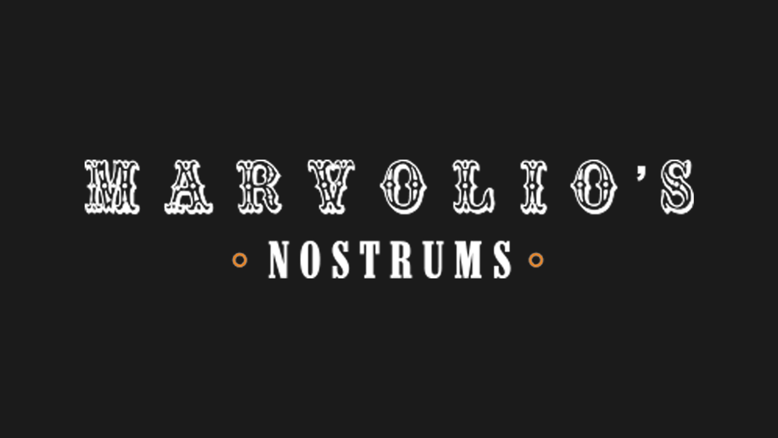
Responsibile for working on a project called Marvolio’s Nostrum. For this project I contribute to hand coding the website in HTML5 and CSS3 and usign Boostrap for Responsive Design and Jquery animations, lightbox and HTML image maps as buttons.
-

Eazi Apps
Freelance Graphic Designer / Digital Marketeer
Assist in developing company branded native Android and iOS compatible mobile apps using the EA Content Management System. Ensure visual images and multimedia files provided for the app are of a high standard and meets the Client and EA’s requirements. Support digital marketing activities, where required
-

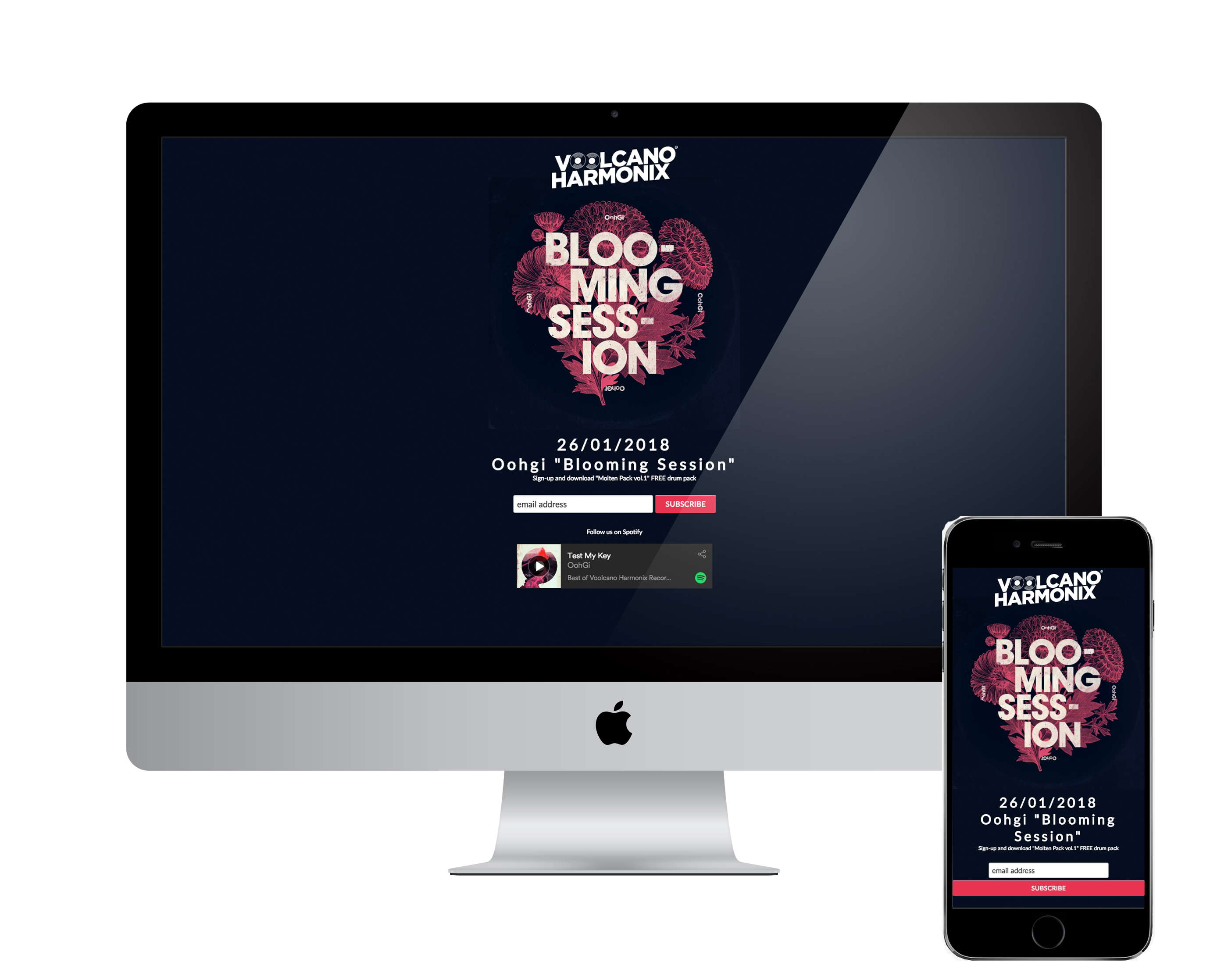
Voolcano Harmonix Records
Freelance Web Designer
Responsible for working on the project, designing newsletters and interacting on a weekly basis with marketing manager, sound engineer. Updating the website and music networks with new music release, designing graphics for Facebook and short videos for promoting the artists.
-

Dario Daniele Design
Freelance
I have worked as a freelance creative. During this time I have restyled some exsisting websites, previously created
-

Smartweb S.r.l
Front End/ Web Designer
Responsible for working on a wide range of projects, designing appealing websites and interacting on a daily basis with graphic designers, back-end developers and marketers. I contributed into improving MobOffice CMS (property of the company) re-styling the HTML of the system, creating new HTML5 and CSS5 modules such as reservations forms, calendars and helped the CMS to compete with other agencies.
-
KingoLab
Freelance Web Designer
Kingolab is a small web boutique based in Pozzuoli, Naples. I worked as a freelance web/graphic designer. I was coding HTML websites mixed with Flash ActionScript2 animations
-
Dario Daniele Design
Freelance Web Designer
I started as a HTML developer, hand coding websites from scratch, creation of Flash animations or websites, coding of custom HTML features like photogallery, videogallery, slides show for small businesses my hometown, Naples.


 REMARKABLE
  EIGHT SLEEP
  DESIGNMODO
  EQUAL PARTS
  THE NEW YORK TIMES
  HULU
HULU  BELLROY PREMIUM
  LOUPE
LOUPE  Source:
 There’s an exception though: plain-text emails do trigger the application of a Dark Mode theme, and the minimum code that blocks Dark Mode from applying to a plain-text email is a 2×1 image—this is to ensure that you can include a 1×1 tracking pixel while retaining a “plain-text”-like feel.
Partial Color Invert
This Dark Mode theming only detects areas with light backgrounds and inverts them so the light backgrounds are dark, while the dark text becomes light. It generally leaves areas that already have dark backgrounds alone, resulting in a fully Dark Mode design. Fortunately, most email clients that use this method also support Dark Mode targeting, so you can override the client-default dark theme.
There’s an exception though: plain-text emails do trigger the application of a Dark Mode theme, and the minimum code that blocks Dark Mode from applying to a plain-text email is a 2×1 image—this is to ensure that you can include a 1×1 tracking pixel while retaining a “plain-text”-like feel.
Partial Color Invert
This Dark Mode theming only detects areas with light backgrounds and inverts them so the light backgrounds are dark, while the dark text becomes light. It generally leaves areas that already have dark backgrounds alone, resulting in a fully Dark Mode design. Fortunately, most email clients that use this method also support Dark Mode targeting, so you can override the client-default dark theme.  No color changes compared to a partial color invert
 Not only does this Full Color Invert scheme most radically change your email, but the email clients that use this logic also don’t allow Dark Mode targeting at the moment. Email clients are still figuring out how to best implement Dark Mode and may be open to feedback from users—especially since not allowing developers to target Dark Mode with their own styles can have a negative impact on legibility and accessibility.
.png) HOW DO I TARGET DARK MODE USERS WITH MY OWN STYLES?
Now we know how popular email clients in Dark Mode handle your regular HTML emails. But what if you’d like to apply your own Dark Mode styles that could very well differ from email clients’ default color schemes? Here are two methods you can use:
HOW DO I TARGET DARK MODE USERS WITH MY OWN STYLES?
Now we know how popular email clients in Dark Mode handle your regular HTML emails. But what if you’d like to apply your own Dark Mode styles that could very well differ from email clients’ default color schemes? Here are two methods you can use: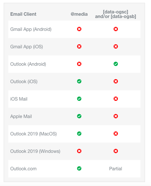 While some email clients—we’re looking at you Gmail—offer email designers no opportunities to target Dark Mode to optimize the reading experience, most clients can be targeted with one of these methods.
 Plus, swap Light Mode and Dark Mode images with the @media (prefers-color-scheme: dark) and [data-ogsc] methods described in this guide.
 The majority of your copy should be included in your email as live text inside of HTML elements.
  By using text size, color, and placement, you can create emails that are easily scanned and read. Try creating bold, high-contrast headlines above smaller portions of copy, and allow for enough whitespace between sections to avoid content bleeding together.
 6. KEEP CONTRAST HIGH
 Single column layouts are also generally easier to adjust across different screen sizes. As more of the world comes online, more people are using smaller mobile devices to access the internet and email. Regardless of which technique you’re using, keeping your emails responsive across different devices is a great way to improve the subscriber experience.
 Zalando’s emails are 450 pixels wide—a long way from the 600 pixel standard we’re used to seeing. Combined with the large CTAs, it looks like Zalando’s mobile-friendly emails cater more toward the mobile crowd.
 Meanwhile, Email Weekly’s emails employ the fluid technique, with a max-width of 960 pixels. It uses media queries to gracefully change the width of the email depending on the device width.
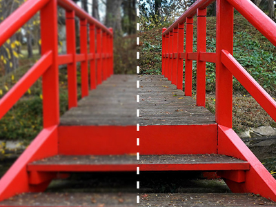
 Can you see the subtle differences between these two emails? The one on the left is using web fonts, while the right one has web fonts disabled. The Outnet have chosen a great fallback font which is very close in look and feel to their web font, showing how you can use web fonts consistently in your email today.
 One of the biggest reasons for not using background images in email was Gmail’s lack of support for the CSS properties background-size and background-position. These CSS properties are important for high pixel density screens and hybrid/fluid/responsive email, where a certain amount of control needs to be placed on how the background images are sized and placed. Both are now supported in Gmail and Inbox by Gmail, so there’s even less of a reason to not try out using background images in email.
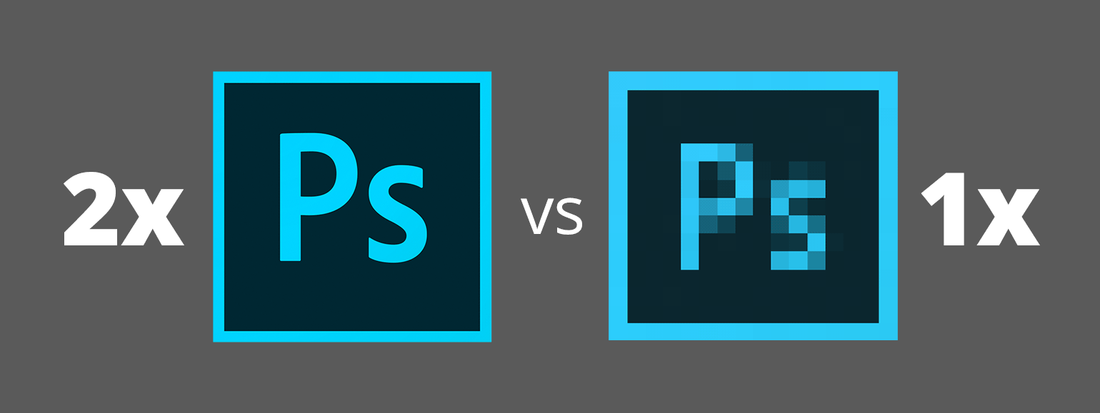
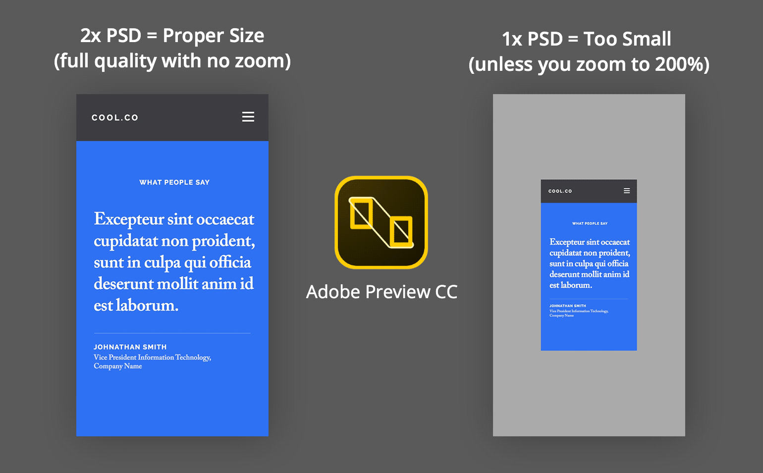
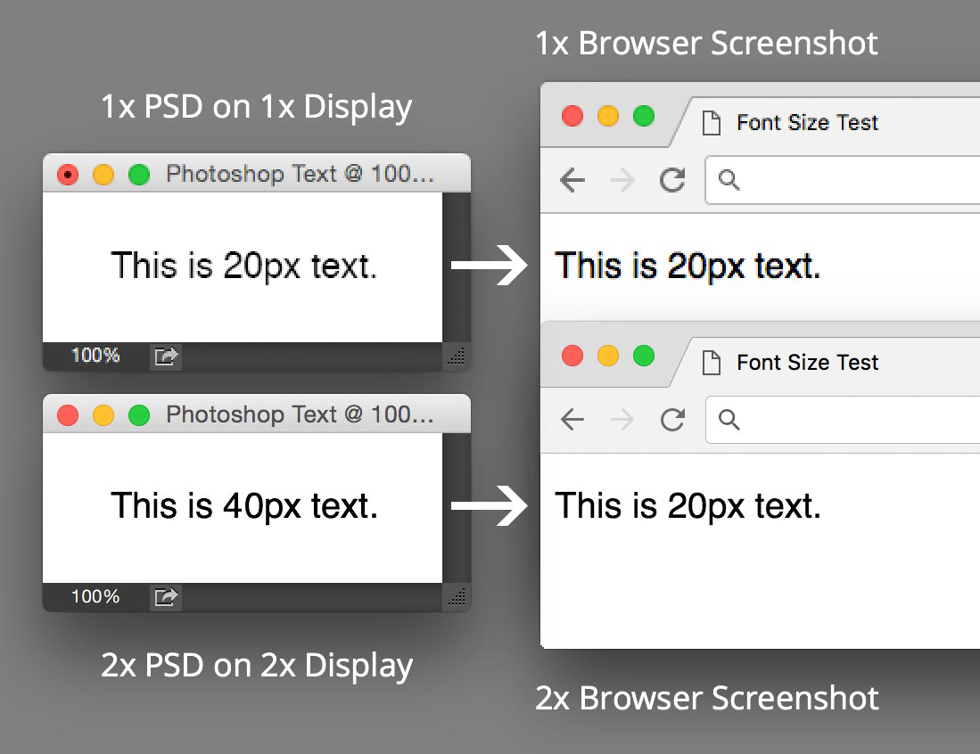
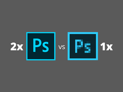
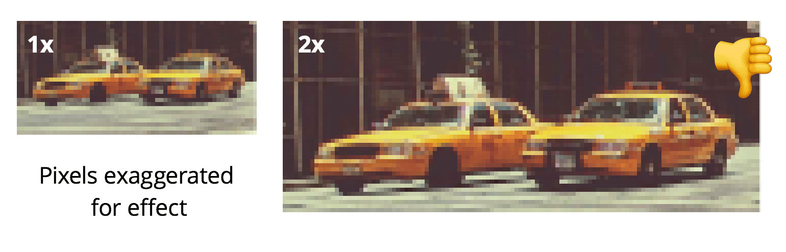
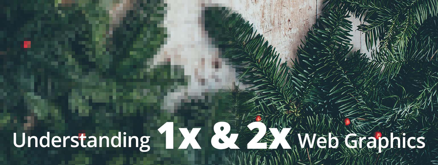 Retina web graphics explained: 1X VS 2X (LOW‑RES VERSUS HI‑RES)
 Beautiful, isn’t it?